[soliloquy id=”undefined”]The 2017 Whitney Biennial, the first at the new spacious downtown location, is a total home run. Form, function and fun come together. The curators make brilliant use of Renzo Piano‘s sprawling architectural design and none of the art is precious, pretentious, or tired. Piano designed the museum with a grid in the ceiling to allow flexibility for installing walls at will and this show, set up like a maze, took full advantage of Piano’s vision. There is a lot of L-shaped corners throughout the cavernous space that creates mini galleries. The cubed off sections help viewers to focus and hone in on the 63 artists one at a time. The little cubbies become commas between thoughts and give viewers breathing room and intimate time to ponder while wandering around the sections. Even though there’s a plethora of images and concepts, in this year’s Biennial, you never feel overwhelmed or visually exhausted.
Upon entering the front door lobby, colourfully worded banners hang from the ceiling, the creation of artist Cauleen Smith. Smith marries text and texture in shapes reminiscent of medieval shields or family crests. The sexy colours and tawdry trims have a showgirl feel, but the messages embroidered on the banners, for instance, “I am so black that I blind you” are of urgent protest. These messages are in light of the ever more frequent marches taking place across the globe in pursuit of freedom and equality. These banners are scattered throughout the exhibition as part of a procession and are meant to read like film stills of our troubled times.
I must stress that the strong visual appeal of the art and artistry tempers the charged messages.
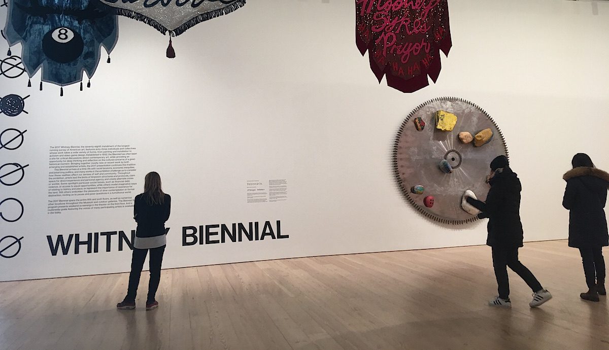
As you get off the elevator on the 5th floor, the first of the two floors reserved for the Biennial, you are hit face frontal with a large and angry Dana Schutz painting. Titled ‘Fight in Elevator’, the commissioned work shows people squashed between closing (or opening) doors. It is quite the greeting! It makes you glad to bypass that wall and enter the main space to see the show. Here is the formal beginning of the exhibition with large wall text mentioning Tiffany & CO. Jeweller’s sponsorship of this (and the next two) Biennials. Curiously, besides the Tiffany signage hangs an oversized industrial saw blade embellished with pretty painted rocks. The relief sculptural assemblage is by the hot young artist Torey Thorton. The piece is titled ‘Painting’ and uses prepainted rocks which were found in both NY and LA. Here again, like the elevator painting beside the elevator is a subtle curatorial metaphor. Subliminally, there is a relationship between Tiffany’s practice of creating a diamond from a rough stone into a faceted gem and Thorton’s artistry of making a beautiful artwork with rocks and a chainsaw. Is art becoming a new jewelled accoutrement?
On the opposite end of the spectrum, is an artwork made out of bologna. Yes, Pope.L aka William Pope, lined both the inside and outside of his exhibition room with multiple slices of real life, school lunch, sandwich style bologna. To make matters more startling, he impregnated each slice of bologna with mini portraits of Jewish people. The purported Jews are sometimes hard to recognise. We know they are Jewish, only because the plaque with his artist statement says so. The plaque tells us Pope did not actually research or verify that his subjects were Jewish. The lack of veracity behind his bold claim is a comment on today’s fake news. Data gathering is baloney. All I can say is that even on the preview of the show, the stuff was starting to smell bad! There was greasy fat drizzling down the walls from the bologna slices and it was pooling into toxic puddles along the box’s border. Point well made!
The most strictly conceptual piece in the show is by the activist artist collective, called Occupy Museums. Occupy Museums sprung up concurrent to the Occupy Wall Street movement. Their mission statement reads “We saw a direct connection between the corruption of high finance and the corruption of “high culture.”” They take offence with art for investment, as well as how art handlers are underpaid and undervalued by museums during these past years of record profits. They say, “As art workers, we stand in solidarity with this struggle. Our labour will be truly valued only when we kick the addiction to obscene wealth that characterises the American and international art world today.” As part of their Debtfair project, for the Whitney Biennial, they selected 30 artists who share common economic conditions of debt. On display in their section are various objects by artists who have incurred debt with education or studio expense. Apparently, artist’s loans and acquired debt have made the CEO of the world’s largest holding company, BlackRock, rich. BlackRock’s CEO, Larry Fink, is a collector and on the board of MOMA. They have a quote from him displayed on the wall “The two greatest stores of wealth internationally today are contemporary Art and apartments in Manhattan’. The message here is ‘Shame on you Mr Fink for capitalising on artist’s hard sweat’.
There is a lot of wonderful painting for the sheer pleasure of painting, throughout the exhibition. Most of the paintings fall into the ‘figurative ‘ category. Carrie Moyers is perhaps the painter that bridges both those categories. Her large colourful canvases are at once abstract but subtly anthropomorphic. Each piece begins with loose washes and then is outlined on top with structured shapes. Maybe that is why they suggest a human body. One senses the flow of liquids underneath the forms, just like our bodies. Moyers is remarkable for achieving something new in abstract art. Moyer’s paintings are off set by the artist Jessi Reaves’ ‘Ottoman and Parked Chairs’ made from Plywood, polyurethane and upholstery foam with tapestry blankets. Reaves has his functional furniture throughout both floors, providing artistic yet comfy seating. Of the other painters, Shara Hughes stands out for her fun, fabulous and energetic landscapes. The hyper-bright colours and repeated oval swirls remind me of what Matisse might have painted if he took LSD. Two more established painters represented in the show are Henry Taylor and Jo Baer. Henry Taylor has a compelling piece, done in his sophisticated yet simple ‘ outsider’ style. It is called ‘THE TIMES THEY AINT CHANGING FAST ENOUGH’ which narrates on the tensions between the police and racial communities. It is stunning and important work. Jo Baer, an octogenarian, has really beautiful masterful landscapes that arise both from her imagination and research she has done in the prehistoric time of County Louth in Ireland. The paintings are endlessly beautiful and strike a spot in our collective unconscious.
Light has a staring role throughout the exhibition. The new Whitney building is blessed with floor to ceiling windows that bring light inside. One artist, clearly this year’s star, Raul de Nieves, covered six floors to ceiling windows with eighteen ’Stained glass’ panels he made using paper, wood, glue, tape, beads and acetate sheets. At night they are lit from inside the building and shine towards the world and during the day they colour the floor from the incoming light. The stained glass story narrates a spiritual tale of fantastical proportions about the transmigration of birth to death. The painter Tala Madani, also focuses on light. Human light! Her series depicts the human form as filled with a light that illuminates the world.
Light, through the lens of a camera, abounds in a variety of video and photographic works. Artists in this category run the gamut of focusing on homelessness, climate change, walled in immigrants, disparate neighbourhoods and violence. ‘Real Violence’ is a 90-second virtual reality experience guaranteed to leave the viewer with posttraumatic stress. Admittedly, I skipped donning the headgear, after learning that you witness a white man brutally beating another white man with a bat to the sound of Chanukah music. I waltzed instead towards the windowed room filled with budding delicate trees. It is a work by Asad Raza called ‘Root sequence, Mother Tongue’. The 26 outdoor trees are meant to flower indoors throughout the show, thanks to special lighting and gardening caretakers the museum hired as part of the exhibition. The caretakers nurturing makes them akin to artists as we witness the joint creative forces bloom.
While this Biennial is filled with socio-political concerns, I must stress that the strong visual appeal of the art and artistry tempers the charged messages. Historically, artists are the preachers and prophets of their time. This show does speak to the turbulence of today, but it does so in poetry. While clearly keeping a finger on the pulse, no artist overplays or overstates his or her point. There are gorgeous, challenging, thought provoking pieces that all seem to say: now is a time we must keep our eyes open.
Words/Photos By Lizanne Merrill © Artlyst 2017 Artlyst’s Verdict – Whitney Biennial 2017 – A Total Homerun
Whitney Biennial 2017 Twelve Of The Best Chosen By Lizanne Merrill
[soliloquy slug=”whitney-biennial-2017-twelve-best”]