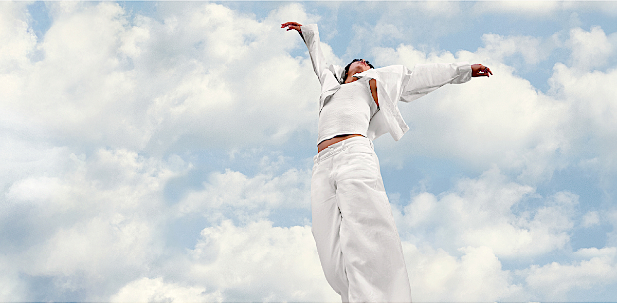
Pantone has announced its Colour of the Year for 2026, and for the first time, the honour goes not to an intense pigment or a market-tested pastel, but to… neutral white. A particular white, of course — Cloud Dancer, a name that conjures something between a scented candle and a yoga retreat. The company calls it “a discrete white hue offering a promise of clarity.” In the current climate, that promise lands somewhere between wilful naivety and a kind of ambient provocation.
Last year’s “Mocha Mousse” at least looked like something you might find in the real world — on a ceramic mug, a mid-range sofa, or a lipstick counter. “Cloud Dancer,” by contrast, slips into the conversation like a diplomatic tactic: neutral, polite, almost antiseptic. The politics of colour forecasting are usually disguised by Pantone’s soft-focus language about harmony and emotional wellness. Still, this year the choice reads like a strategic retreat from anything that might actually touch the times we’re living in.
Leatrice Eiseman, the Institute’s executive director, attempted to anchor the selection in our collective crisis of overstimulation. “The cacophony that surrounds us has become overwhelming,” she said, adding that Cloud Dancer is meant to quiet the noise and restore focus. Her argument isn’t wrong — the past few years have been loud enough to fray anybody’s nerves — but presenting white as a balm feels a little too convenient, a clean slate offered to a world that hasn’t earned it.
Pantone’s press language insists that Cloud Dancer symbolises a “fresh start,” a “return to reflection,” a “space for creativity.” All fine ideas, though the company repeats them with the zeal of a mindfulness app. White, they remind us, is a blank canvas — which is true enough, but it is also historically the colour of erasure. In design and fashion circles, white can signal purity, simplicity, and renewal. But in today’s hyper-discussed political landscape, it also carries baggage the press release seems determined not to acknowledge.
The marketing machine, of course, has no such concerns. Pantone has rolled out its usual array of colour harmonies, palette suggestions, and atmospheric vignettes. In their scenario-building, Cloud Dancer can do everything: calm an overstimulated consumer, support other colours in a palette like a benevolent stagehand, and harmonise with anything from “shadowy shades” to “aqueous blue-greens.” It’s the sort of description that makes you forget they are talking about white paint.
Pantone also casts Cloud Dancer as an architectural force — the “scaffolding” of good design, the shade through which all other colours supposedly find their fullest expression. It’s an odd bit of hyperbole, as though white hasn’t already dominated Western interiors, galleries, and luxury branding for the better part of a century. If anything, the institution seems to be retrofitting a justification for choosing a colour that can’t possibly offend a client.
It’s worth pointing out that colour trends are less about capturing the zeitgeist than shaping consumer mood. An intense colour sparks appetite; a neutral one relaxes the market. Cloud Dancer does the latter with Pilates-level dedication. It’s easy to picture it already lining the aisles of department stores, promising calmness and mental order to the aesthetically exhausted.
Still, the choice tells us something about the moment. After years of neon optimism, earthy nostalgia, and digital-age pastels, Pantone has pulled the emergency cord marked Reset. Whether that says more about global anxiety or market fatigue is up for debate. But perhaps the most revealing thing is the sense of disengagement the announcement provoked: a collective shrug at a colour meant to symbolise everything and nothing at once.
In a year when the world could use a dose of clarity, Pantone has given us white — not the blank canvas of potential they insist upon, but the kind favoured by institutions when they don’t want to commit to anything too vivid. A colour chosen, perhaps, for a culture that isn’t sure what comes next.