

Anyone wanting to understand the innovative art of the Italian conceptualist Alighiero Boetti (1940-94) should head to Ben Brown Fine Arts / Claridge’s ArtSpace, where ‘Regola e Regolarsi’ gives them all they need. There are some 90 career-spanning works, informatively presented to demonstrate Boetti’s explorations of serial schemes and systems; his innovative approach to self-portraiture; his use of language; and his way of producing work with the assistance of unknown third parties. I spoke to Mark Godfrey, who curated the Tate’s seminal 2012 survey ‘Alighiero Boetti: Game Plan’ as well as this, the largest subsequent presentation of Boetti in London.
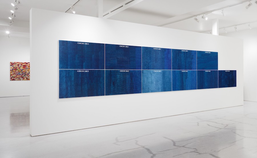
Alighiero Boetti: Ononimo, 1973 – Ballpoint pen on card 11 parts, 73 x 103 cm each – installation view
How have you put the show together?
The first room roughly coincides with the world Regola (‘Rules’), and considers the key concepts that Boetti worked with in the first eight years of his practice. It looks quite dry and conceptual, even though it contains a lot of his personal interests. The second part of the show has an explosion of colour and textures, so even though the rules still exist, there is an adjustment to them – Regolarsi means ‘adjustments’. The third space, viewable on request, contains a selection of drawings from his studio. Boetti is celebrated mostly for works operating through some sort of fabrication process. He was, though, the kind of artist who could never stop doing things with his own hands – but he felt that work was very much secret. He would make drawings by experimenting with such techniques as blowing ink, using stamps, or dipping elastic bands in paint and dropping them on sheets of paper. And had his own cosmology of animals which he drew – he liked animals with a great sense of energy and movement.
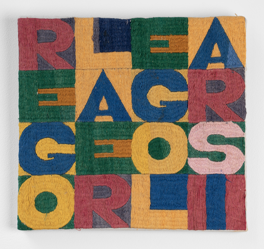
Alighiero Boetti: Regola e Regolarsi (Order and Disorder), 1978 – Embroidery, 23 x 24 cm
How does the word square ‘Regola e Regolarsi ’ illustrate Boetti’s approach?
When it came to embroidery he would write the phrases out and send the canvases off to the embroiderers, initially in Afghanistan, then in Peshawar, leaving the individual colour choices to the embroiderers. They were women commissioned by men, so there was an intermediary between Boetti and the embroiderers. That contrasts with most artists in the sixties: they would either have work fabricated by people that they visited a lot, or might have assistants in their studios – but Boetti set up a system of production whereby people unknown to him completed the work. He liked the idea that the final appearance of the work was as much down to their input as his. The union of order and disorder – Regola e Regolarsi – is something Boetti was obsessed by as a good way of making art. In the word square the order is in that it’s a 16 letter phrase that fits perfectly into a square, and in the fact that every letter gets the same amount of space. The disorder is in the way that the three words are run together, and also in the choice and combination of colours not being controlled by him.
There are several biro works. How do they operate?
Boetti’s biro drawings would be made by students – he worked with a woman in Rome who would commission someone to fill in the biro sheets, so they are anonymous. But they are also eponymous, because they give a sense of the individual draughtsperson’s sensibility. He made up the word ‘ononimo’ – combining the Italian for ‘anonymous’ and ‘eponymous’ – to capture this idea that something was both anonymous and individual. Boetti didn’t know – and didn’t want to know – the people who finished the work for him, and therefore something is left to chance. The show includes an eleven panel biro work using the word ‘ononimo’, which is very lush in its blue. It was made by eleven different people who each took their own approach to the task of filling out the paper. In some drawings, the vertical lines are compact, the horizontal bands are tidy and even and there is little overlap, so there is a consistency of colour. In other drawings, the lines are more dispersed and the bands wavy, or there is more overlap – and consequent darkening. Boetti was able to achieve a real beauty with blue biro which is quite remarkable, given it’s an office tool, really.
Was the number 11 important to Boetti?
Yes, very important: he was interested in pairs and twins – he actually photographed himself as a twin – and 11 was like a twin but with internal difference, as one of the ones has a value of one, and the other has a value of ten. That’s why there’s an eleven-part Ononimo work.
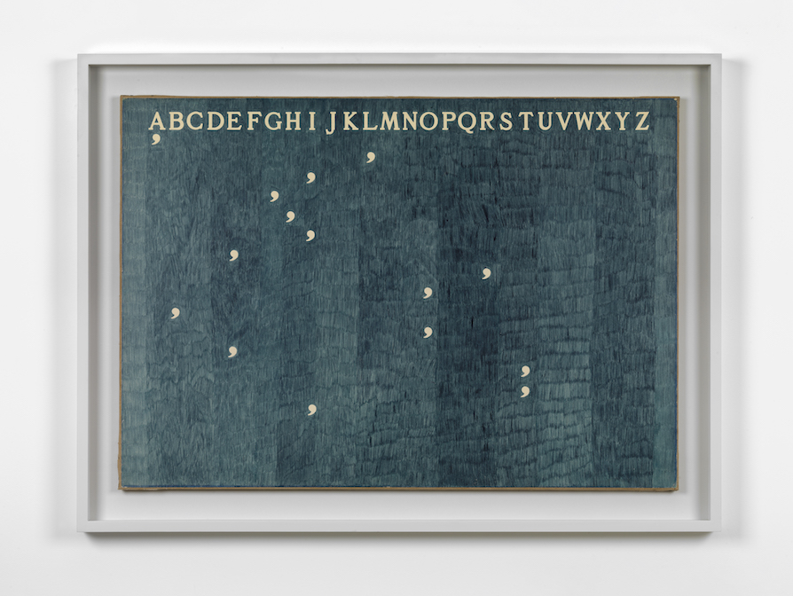
Alighiero Boetti: Mettere al Mondo il Mondo (Bringing the World into the World), 1973 – Ballpoint pen on paper laid down on canvas 2 parts, 71 x 100 cm each
The biro works often feature commas. What role do they play?
What would be handed to the people making the biros was a blank sheet with stencilled letters and commas in Boetti’s specified font – their job was to fill in the paper but not go over those parts. He liked commas because they suggested movement rather than the stasis of a full stop, a place of pause but where something continues. They indicate the letters to be read from the alphabet above. You go back and forth between the alphabet and the commas, and that spells it out. It’s pretty simple, but the commas seem to float in space, so it’s more difficult than one would think to figure out the phrase. In ‘Mettere al Mondo il Mondo’ they spell out another rule of his that I like to translate as ‘putting the world into the world’ – that the artist takes things that are already in the world, and puts them back into the world. Where Yves Klein invented a particular kind of blue, Boetti just takes the available four colours of biros – he often uses readymade colours. Or he takes phrases, number sequences or office calendars and puts them back in the world.
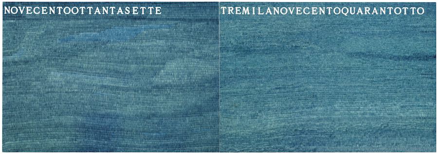
Alighiero Boetti: La Metà e il Doppio, (Half and Double) 1974 – Ballpoint pen on paper in two parts, 70×200 cm
Here he took the number 1974 and divided it in half, so one side reads 987 in Italian. On the other side he doubled it, so that reads 3948. The numbers look random but in the middle of them is the date of the work, so it’s a way of taking something that exists at that point – the year it was made – and putting it back in the world.
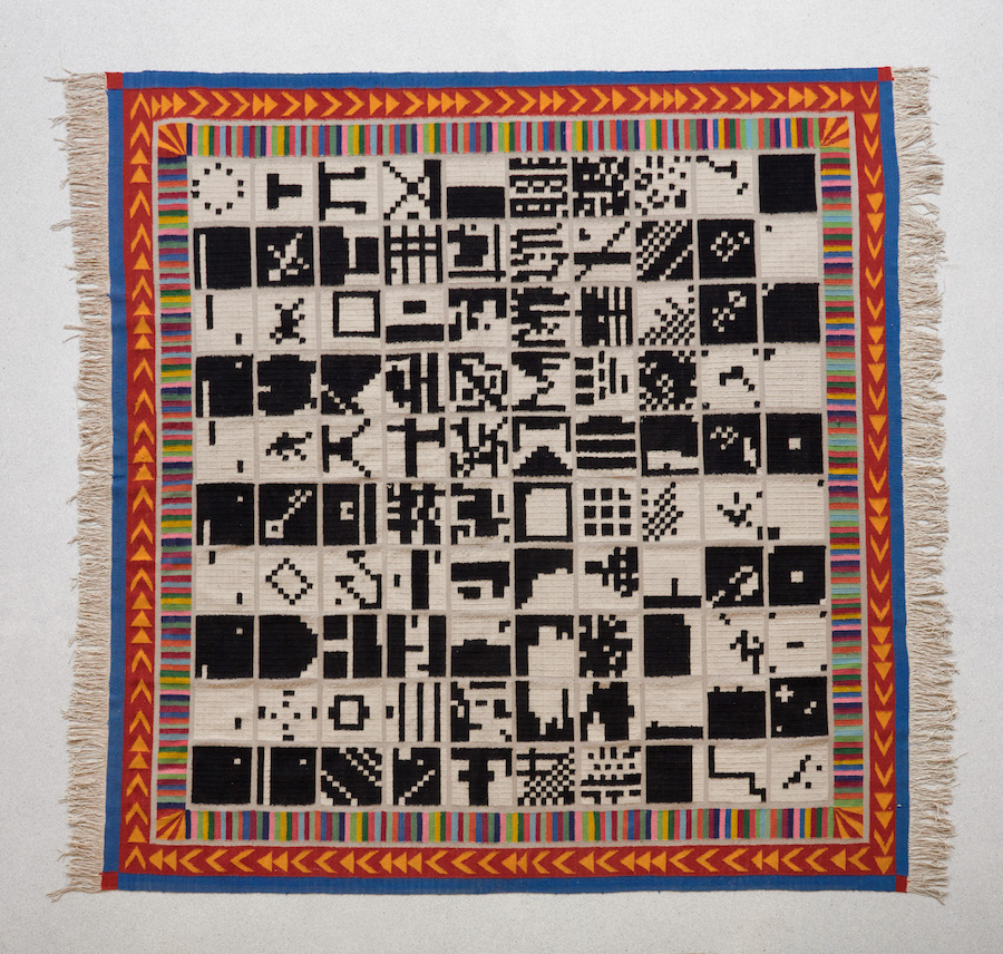
Alighiero Boetti: Alternando da Uno a Cento e Vice versa (Alternating from One to a Hundred and Vice Versa), 1993 – Woven fabric 300 x 290 cm.
What’s the logic of these black and white patterns?
There’s an embroidery and a rug which come out of a kind of number game he invented, which is called ‘alternating from one to a hundred and vice versa’. It sounds dry but is actually very playful. He created a grid of 100 squares, with each square itself divided into 100 squares. In the top square you have one black and 99 white squares. In the next square that alternates to two white and 98 black, then three black and 97 white and so on… Once he’d invented this schema, he got other people to plot out the squares, and would make embroideries or rugs from their designs. Of all his schemas, this is probably the most expansive, as there are billions of ways to do it – as for example there are 100 options for where to put the first black square – and so the realisation becomes incredibly open. The chromatic and numeric schema provides an order, and the disorder lies in not knowing how it will be fulfilled.
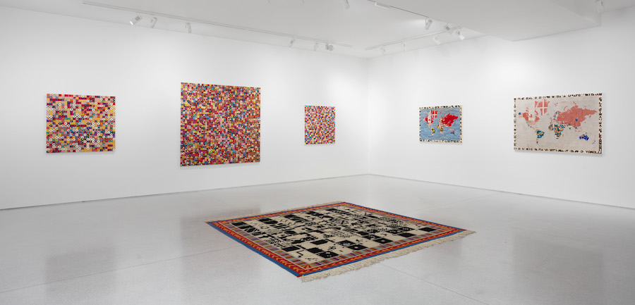
Alighiero Boetti: installation view. Including two Mappa
The Mappa might well be Boetti’s most famous works…
The idea of the world maps was to fill in the border of each country with the design of its flag. The difficulty was what to do when there was a civil war, and so a dispute about what the flag should be. In those instances – a beautiful idea – he kept the map as a blank, showing that there is a dispute, but undecided. Boetti saw the maps as particularly good examples of his principle of non-intervention. As he put it in 1974: ‘For me the embroidered Map couldn’t be more beautiful. I did nothing for this work, chose nothing myself, in the sense that: the world is shaped as it is, I did not draw it; the flags are what they are, I did not design them. In short, I created absolutely nothing.’
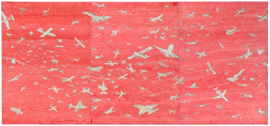
Alighiero Boetti Aerei (Planes), c. 1987 – Ballpoint pen on paper laid down on canvas 3 parts, 139 x 100 cm each
Why was he interested in planes?
Boetti had collected images of aeroplanes whenever they appeared in newspapers and magazines, and had made transfer drawings of them. In 1977 he teamed up with an illustrator called Guido Fuga, who made the composition – a triptych of the sky filled with aeroplanes, all flying in different directions and of various sizes. A lot were to do with the Cold War – they’re mostly American and Russian planes – so you could see it as a romantic image of concord instead of violence. Working with Fuga he made this arrangement – an example of order and disorder because the planes are in complete disorder, but there’s an order in that there are no crashes. Boetti liked Fuga’s drawing so much he photographed it and printed it at different scales, allowing him to make many aeroplane works from small to very large, some with watercolour, some with biro.
Alighiero e Boetti: Regola e Regolarsi is at Ben Brown Fine Arts, 12 & 52 Brook’s Mews London W1K 4DG, and Claridge’s ArtSpace, Brook’s Mews – to 31 August. Images courtesy of Ben Brown Fine Arts.