For two decades the Munich-based painter Richard Schur made rectangular compositions taking the grid to new levels of looseness and complexity. Those paintings generate emotions, suggest place, construct architectural effects, seduce and play with us – but only insofar as those qualities emerge from his central concern: the primacy of colour and what colour evokes. Lately he has moved towards shaped paintings incorporating curves, but they remain intuitively driven by colour. I spoke to him at his new solo show in Kristin Hjellegjerde‘s London Bridge space.
What led you to change your underlying language?
I was building up the virtual worlds of my compositions as an ‘architect of colour’, based on squares. That provided both gravity and the horizon, but at some point I developed the intention of adding one other elementary form. I’m 50 now, and I don’t want to be just repeating the things I know how to do. The circle was obvious from the sun and the moon, so I thought I could use that to go further. That led me to the concept of a shaped canvas. Once I’ve developed a shaped form, I can experiment with different decisions and colours, and look at how they respond to the outer form. That shaped form became the stage for a classical interaction of colour.
But complete circles do not appear?
For me a painted circle is a bit of a cliché. And there are many reasons to use rectangles – just look at your phone – but not a circle. And the partial circles create more of a back and forth with the rectangular elements. They introduce an extra complexity: the implied full shapes and the partial shapes. They are also like silhouettes of sculptures.
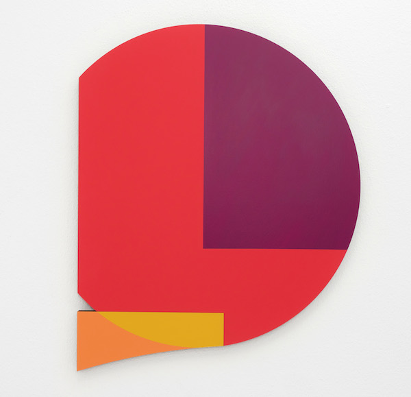
Richard Schur: Sunset Story, 2022 – Acrylic on Masonite Photo Courtesy Richard Schur/Kristin Hjellegjerde Gallery
Why does the title of ‘Sunset Story’ encourage us to see a landscape?
Mondrian – who is my hero – said that colour and line should be consciously composed as other than in nature, that non-objective art should not have references. In that context it’s playful – ‘serious play’ – that a composition that starts from zero can arrive at the possibilities, as here, of mountains and the sea. So when I call a consciously non-narrative work ‘Sunset Story’, I am teasing Mondrian a little.
Could it also be a speech bubble?
Not yet, but I like that.
What about the sides? There’s an ambiguity between apparent and real shadows. Is that why they’re black?
The open sides look best with the dark colours. They’re not black but a very dark brown, slightly warmer than black, softer. The painting is consciously flat, but you see the side and it changes with your viewing angle: that kinetic aspect sometimes supports, sometimes changes the perception of the composition. The Masonite boards I mount together consist of wood fibres – it doesn’t warp and you can do what you like with it. As it comes out of the router you can see what it is made of: up close it looks like a fabric, like dark velvet, and I like that.
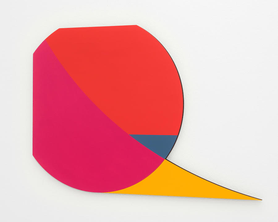
‘Red Sun’ has a different sort of space, doesn’t it?
Yes, it suggests a cut-out or zoom-in, or looking through a lens or periscope, a frame – you see through to beyond. And you look through somewhere that’s square, contradicting the colour’s evocation of a sun. I do make sketches for these works – I called this one ‘Sunset for Me’, it felt very personal – but I paint very much alla prima, mixing directly on the board. It took three layers to get the right vibration between the colours.
How many separate pieces are involved?
Two, cut with a router and saws. If you split it up they are made from circles and squares, subtraction and addition. I order circles, then cut them back myself. There is something very industrious and serious about it. And I like the ambiguity between the cut divisions and the painted divisions. Sometimes I do fuse two pieces together to read as one, but here I intuitively liked the gap where red meets yellow. And I am also attracted to the possibility of bigger gaps – I have experimented with 5mm – I still have the thrill of newness so I’m exploring the possibilities.
The colour in ‘We’ operates rather differently?
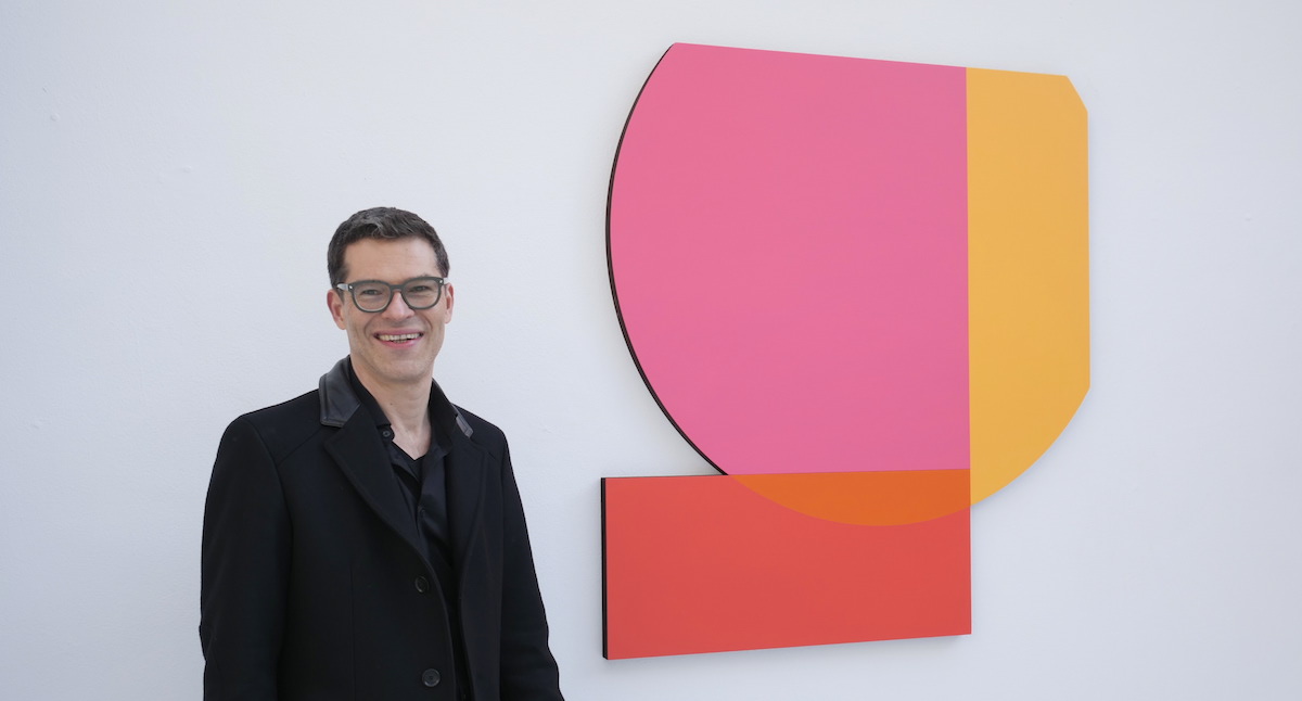
Yes, most works have the classical warm and cold contrasts, but this all warm. I worked a long time on the yellow, which was very tricky to make not too yellow, not too warm, not too cold. I mixed it on the board directly until I found the right level – you have to keep spraying to stop it drying. I called it ‘We’ because all the reds are together, but there are two shapes separate – what unites and separates those things made me think it might be about how society works. It’s a formalist work, of course, but Mondrian and Malevich were always asking: why are we doing this? It has to do with life and we are human beings…
So there’s a transcendental aspect?
Yes, there is something behind, but it should be a mystery. You see a clear form, a clear setting – the hard edge doesn’t lie – but at the other end there is this hovering moment of transience, hard to grasp but visually happening. It’s like when music evokes emotions – it was seeing how painting could operate that way that first touched me and drew me in to art as a teenager. Perhaps, to simplify, it has to do with ‘ideals’, maybe in some utopic way. Also, of course, creating beauty. I guess that sounds old fashioned…
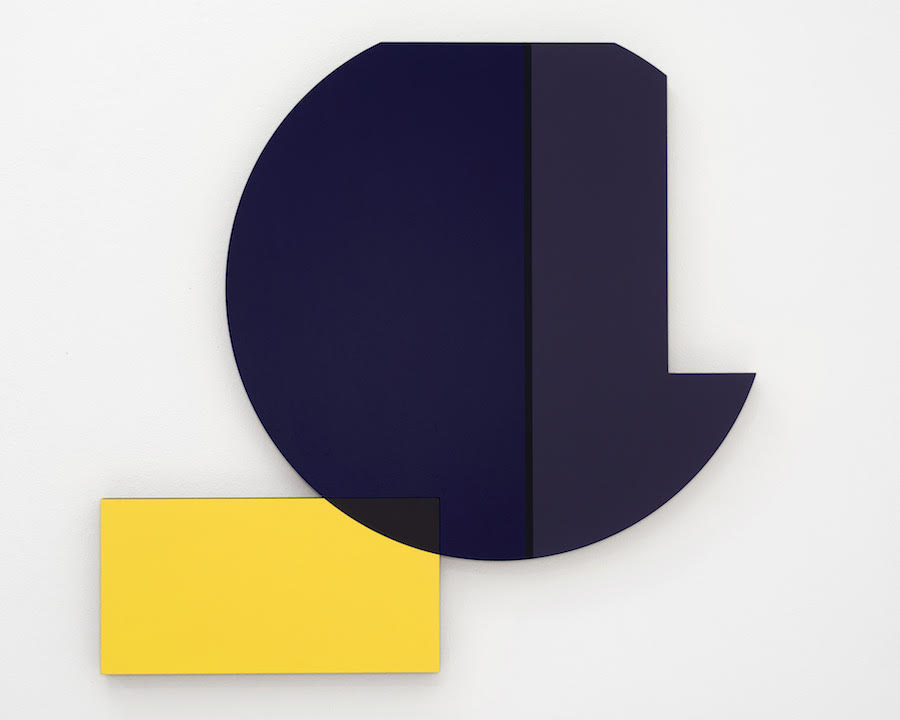
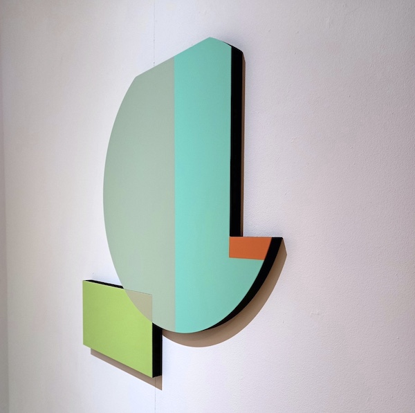
Richard Schur: Inter, 2022 Photo Courtesy Richard Schur/Kristin Hjellegjerde Gallery
What’s happening with that dark, narrow vertical shape in ‘Inter’, almost like a line between the wider dark sections?
My old art teacher said to figurative painters: avoid the outline, when two colours meet that’s also a line. I avoid conscious lines, but this was about how the different tones meet. I didn’t want them to meet directly. It’s as if the interactions of colour represent universal relationships. Two similar colours meet, but not fully. They can’t get together as there’s something in between.
Your American paintings have previously felt different from your European paintings. Where were these made?
Normally I am influenced by where I am, and its light, but these were born in the reset mode of the lockdown, so I was withdrawn in my studio in Munich. It could be they reflect a desire to imagine places elsewhere. And with lots of looking through something, they feel like gazing out to a far horizon.
Is that a tightly organized studio in which you were locked down?
No, it’s messy! I’m very informal, chaotic rather than organized, more ‘play it by ear’ than scheduled. My wife says people looking at my art would not expect me to be like that!
Interview: Paul Carey-Kent with Richard Schur Top Photo: Richard Schur with We, 2022 – Acrylic on Masonite All Photos: Richard Schur Courtesy Kristin Hjellegjerde Gallery
Richard Schur: ‘Edge of Abstraction’ is at Kristin Hjellegjerde Gallery, 2 Melior Place, London SE1 3SZ from 9 December 2022 – 21 January 2023. You can see a full range of Schur’s past works on his own website.