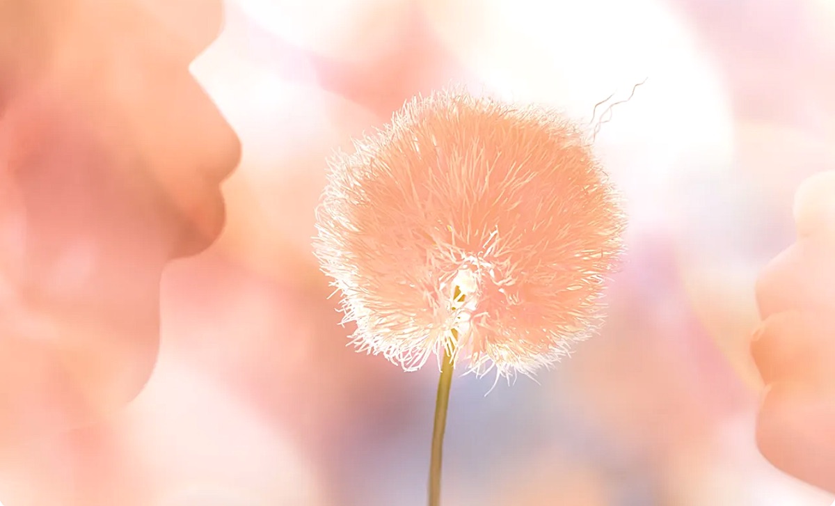
In the kaleidoscope of hues that paint our world, Pantone, the ultimate authority on colour, has declared 2024 as the year of “Peach Fuzz.” This orange-pink revelation, unveiled by the Pantone Color Institute, transcends mere chromatic trends; it serves as a visual manifesto for compassion and human connection in the upcoming year.
Described as a “velvety peach tone,” Peach Fuzz is not just a colour; it’s a statement. Pantone elucidates its choice, portraying the hue as gentle, warm, and cosy—an aesthetic manifestation of our collective yearning for closeness. Subtly sensual and heartfelt, Peach Fuzz symbolizes our desire to nurture ourselves and others, embodying an all-encompassing spirit that enriches mind, body, and soul.
Leatrice Eiseman, Pantone’s executive director, articulates the rationale behind this choice, emphasizing the colour’s radiant warmth and modern elegance. In Pantone’s vision, Peach Fuzz is more than a pigment; it resonates with compassion, offering a tactile embrace that effortlessly bridges the gap between the youthful and the timeless.
The selection process behind Pantone’s Color of the Year involves meticulously examining emerging trends across diverse industries. Pantone’s experts leave no stone unturned, from entertainment and films in production to fashion, design, travel destinations, and societal conditions. The influences extend to technology, materials, textures, and effects impacting colour, along with the sway of social media and upcoming sporting events that capture global attention.
Pantone’s Color of the Year isn’t merely a proclamation; it’s a harbinger of trends that will infiltrate product development, influencing consumer decisions across fashion, industrial and interior design, and product packaging. Previous years saw the reign of Viva Magenta in 2023 and Very Peri in 2022, each leaving its indelible mark on the aesthetic landscape.
Peach Fuzz steps into the limelight against the backdrop of a digital world, offering comfort, calm, and beauty. Modern yet nostalgic, this hue encapsulates the yearning for nurturing, empathy, and compassion—a soothing balm for turbulent times. Laurie Pressman, Pantone’s vice president, emphasizes the importance of a colour that uplifts, providing gentle lightness and an airy presence that propels us into the future.
As the announcement reverberates through social media, reactions are as diverse as the colour palette. While some laud Peach Fuzz’s beauty and refreshing vibe, others dismiss it as dull, out-of-touch, or reminiscent of overplayed vintage hues. One tongue-in-cheek critique even dubs it “a very democratic shade considering it doesn’t look good on anyone.”
In a world craving hope and regrowth, the choice of Peach Fuzz sparks dialogue, revealing a spectrum of expectations. Whether embraced or contested, Pantone’s Color of the Year ignites conversations that will ripple through the visual landscape of 2024.

