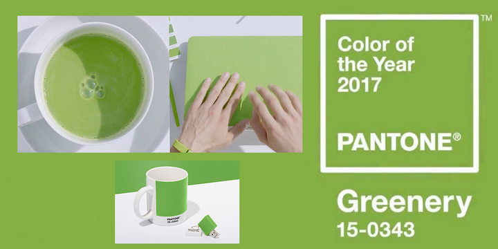
Pantone has released its Colour of the Year for 2017 and it’s a lush shade of green called Greenery! The hue is known officially as 15-0343 TCX Greenery is set to grow on all of us (no pun intended) with an estimated product range amounting to thousands of items from electrical goods to clothing. Never underestimate the power of Pantone’s Colour of the Year selection, last year’s pick, Rose Quartz, and Serenity has been seen on products everywhere in the last 12 months.
Pantone describes the colour as; “Greenery is a fresh and zesty yellow-green shade that evokes the first days of spring when nature’s greens revive, restore and renew. Illustrative of flourishing foliage and the lushness of the great outdoors, the fortifying attributes of Greenery signals consumers to take a deep breath, oxygenate and reinvigorate. Greenery is nature’s neutral. The more submerged people are in modern life, the greater their innate craving to immerse themselves in the physical beauty and inherent unity of the natural world. This shift is reflected by the proliferation of all things expressive of Greenery in daily lives through urban planning, architecture, lifestyle and design choices globally. A constant on the periphery, Greenery is now being pulled to the forefront – it is an omnipresent hue around the world. A life-affirming shade, Greenery is also emblematic of the pursuit of personal passions and vitality.”
Nature’s neutral, PANTONE Greenery is a versatile “trans-seasonal” shade that lends itself to many color combinations. As displayed in the 10 palettes below, Greenery is paired with neutrals, brights, deeper shades, pastels, metallics and even the enduring presence of PANTONE Color of the Year 2016, Rose Quartz and Serenity. These palettes easily cross over fashion, beauty, product and graphic design applications.
What is the PANTONE Color of the Year? A symbolic color selection; a color snapshot of what we see taking place in our global culture that serves as an expression of a mood and an attitude. Pantone has given the world its annual chosen colour since 2001, forecasting design trends from fashion to homewares. But it insists that the shade says something about our society, too.
Whether this has the power to change our tastes is debatable but it does have an effect on industry’s way of choosing colours in product design. Will it impact on the way artists choose their palette? Our experts say, “This is doubtful, but wait and see!”


