

Edge to Edge features artists who use hard edges of some kind in their work but who are not necessarily defined by them. The hard edges they use are often tempered, mixed or contrasted with chaos, mystery or even humour. Simon Streather takes a closer look at the artists in this show.
Complex analysis can give rise to simple forms and simple forms may arouse complex thoughts. Perhaps this is the fascination we find in what is referred to as reductive art. Or else the simplicity we are presented with remains, quite simply, irreducible and beguiling. Within the encounter, the artwork retains an inscrutable presence as it takes its place alongside us in the world of things. In a sense, it remains a mystery, unknowable.
a welcome switch from the importance of the artist to the agency of the viewer
Hard Edge Painting is a realm of practice that has a surprising longevity historically littered with manifestos, clubs and camps with their fallings-in and fallings-out. One can choose to see this as the inevitable end of the desire to define and stake out a territory that may have had its beginnings in notions of liberation yet often ends in rivalry. There would seem to be enmity between the power of the persuasive word and the value of perception. The commitment to an impersonal visual language was particularly strong in countries suffering totalitarian oppression, such as South America and Eastern Europe.
A concrete, constructivist approach has long been associated with ideas of purity and absolutism or at least been seen as reductive. Therefore, it is interesting to note that this survey presents much that could, or would, have been considered tainted and impure.
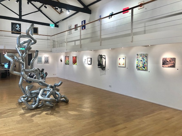
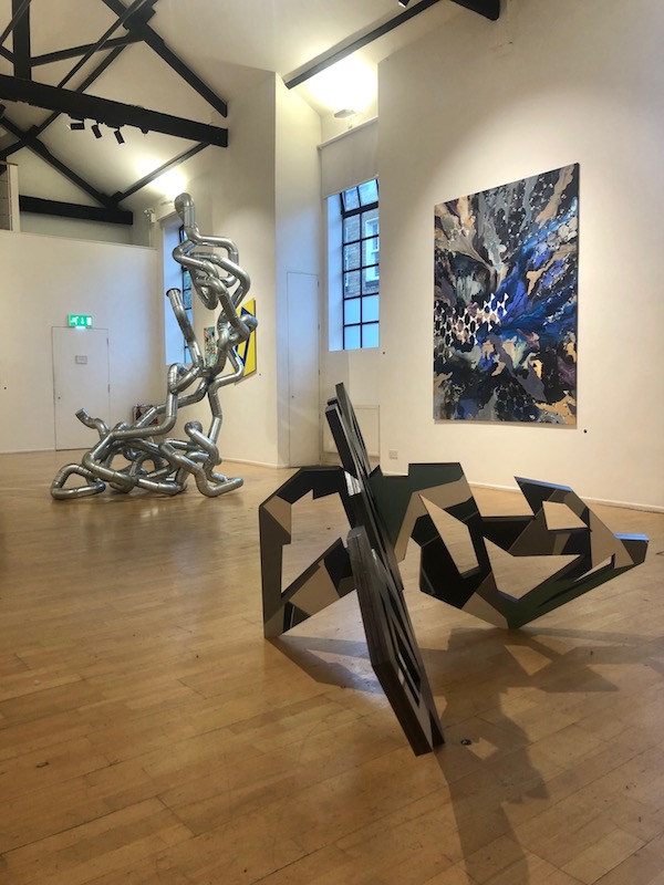
Edge to Edge, installation shot
If we look firstly at the paintings, figuration appears in Graham Crowley’s paintings. The black scumbled marks force geometric shards of often vivid uninflected imprimatura to be read as roofs, fields and rivers. The skilled artifice of mark-making is unmasked, as much as is the brain’s utilitarian functioning in its making a pictorial sense of stimuli.
Perhaps the painting which appears to most clearly fulfil the description of a Hard Edge Painting would be ‘Cobalt & Lemon Sequence Number 4’ by Simon Willis. Yet on reflection, despite its ostensibly strident assertive appearance, what seems to be at stake is ambivalence and indeterminacy. The shaped panel can be seen as a tilted rectangle. The geometry from which the simple form is generated is often partially hidden in Willis’ paintings. Therefore we could imagine what we see is part of a larger tessellated plain. The shimmering pure colour can be given a name, and yet does that help with the definition? As the artist once said, ‘Colour is an idea.’ The two chosen colours oscillate and jostle for the position of figure or ground in a way that evades resolution. The painting resembles a door or portal bearing onto an uncertain space. The bright presence of this work belies its age: made in 1989 it is by far the oldest painting in the exhibition. Possibly the direct and precise language used is due to a conviction regarding the power of visual art, albeit in a world which is increasingly swamped with images.
The paintings of Simon Pike show a layered synthetic approach. These colours buzz and pop in rainbow striations reminiscent of the ubiquitous television screen. In one painting, shadowy figures appear as coloured silhouettes suggestive of hype, advertising and newsreel. The flow of glossy translucent paint gives the image an aqueous quality, resisting fixity. In both works, a final layer of almost opaque white invades, as if to suggest the inevitable blankness of the screen.
Tom Fleming presents studied and calm reflections on surface and depth. Ordered colours are painted fading around a central white disc of untouched paper. In another work a low relief is created with the layering of coloured papers, literally building and articulating a square. Another work on rougher paper suggests a play of architectural depth and repeat pattern. There is a beauty in the restrained awareness of the hand-made, demonstrated in the application of the subtly tuned greys and paper cuts.
The prints of Fiona Grady are pale and grey, reminding us of her interest in the qualities of light. Triangular motifs fall regularly across the page and are cut by the edges of the paper. These patterns seem to sit on photographically derived images of an organic ground.
Paul Bonomini, Alexander Hinks, Lisa Traxler
A painting by Ian Parker shows a central reddish dun coloured rectilinear shape which is either encroaching on or being occupied by other more colourful possibilities. It is hard to know if these forms define or challenge one another.
A notion of blankness or void seems to be central to many of the works shown here, in relation to an opposing notion of painting opened-up as an area of free play and experimentation, released from the shackles of representation and narrative. In many cases, this is mirrored by a division between high colour and monochrome.
In Robert Dunt’s work, bright jagged shards of colour jostle in space, forming triangles, rectangles and circles with a palpable sense of relish. Yet this is overlaid with what he terms ‘distortion forms’: specks of white and black paint that refuse to accord with the painting beneath. The artist has referred directly to his desire to disrupt and confound by embracing chaos and making order.
The inescapable influence of Malevich is played out in several works to varying degrees: sardonic, as an endgame strategy or else a significant influence. Juan Bolivar presents us with a painting of a black square, framed in cream bearing the word ‘Marshall’ as the recognisable logo of the manufacturer of stage amplifiers. There is irony in the opposition of the mute and impassive little square to the entertainment industry and stadium rock. Also, the word ‘marshall’ itself suggests a militaristic grouping or allegiance. Indeed, Bolivar has plugged himself into art history – much as the amp needs a source – and remains resolutely with a foot in each of two camps.
The small collage by Lucy Cox takes an altogether gentler approach. The indebtedness to early constructivist works is clear, nostalgic even. Circles and strips play out positive and negative spaces with the careful placement of hand-painted papers in strident reds alongside grey photographic papers. Vanya Balogh shows a painting that suggests a more troubled approach to history. The ground of the painting is muddy and interrupted with accrued rifts of black paint, almost covering striations at the edges of previously applied symmetrical flag-like patterns. Over this, golden chevrons radiate from the scarred centre; only the gold paint is itself muddied and dulled. A nod to Malevich’s architectonic models seems to appear in the videos of Sandra Crisp. Only far from being a stilled utopian model, we are presented with an oscillating, almost breathing mass of units, accompanied by the human and machine-made cacophony of the street. This feeling of overload is sensed too in the hectic but carefully constructed collage she presents.
To my mind, my paintings focus on the material and temporal or performative act of making. The title ‘Tribute’ would perhaps most obviously seem to refer to Malevich, yet could suggest a number of works by various artists in different media.
Almuth Tebbenhoff has an intriguing wall-based sculpture where the buckled and broken elements of frame have been fixed to create a rough cuboid behind which is the wall. What we could see as the surface is a net stretched and sagging to accommodate a ball that has escaped the frame and yet is held in suspension by the net. The interior of the frame is highlighted with a coating of fluorescent paint, whilst the rest of the object remains raw.
Fracture is abundantly apparent in the sculpture and painted collage by Lisa Traxler. Here slashes of colour – which are never exactly bright – are interrupted with black or, in the case of the sculpture, voids in the flat interlocking sections. They seem to suggest but never resolve into a recognisable whole. These works seem suggestive of displacement and flux.
Nick Grindrod’s paintings hover in a space of ambiguity. Grounds that appear frustrated by traces of previous effort have the incidental beauty of old worktops. Over this, geometric models are painted in clear colour suggestive of depth and space only to be countered by smudges and erasures, which return us to the fact of the painted surface. His seems a heterodox world of possibilities which favours the suggestion of doubt before resolution.
The large painting ‘Beyond’ by Alexander Hinks describes a space where planes of repeated patterns constantly seem to emerge from seething swirls of inchoate pigment only to be submerged once again. The colours of this frozen magma seem to rise into distant celestial blues only to drop back into earthly clay. Is this a suggestion that the beyond can only be glimpsed within the play of the dual and opposing forces he orchestrates?
Collage is employed most obviously in Noelle Genevier’s unframed and vulnerable works, with one even slipping off its plinth. These are made of fragile paper fragments depicting plant and insect life. The images which seem derived from magazines or screen grabs show a concern with ecology, which is also implicit in the modest material form and scale. Collage is also evident in Jane Pickersgill’s works, only this time the preciousness of the fabrics used draws on her experience of the fashion world and cutting room to present intimate reliefs where the plane is fragmented and dissolved through smoky and sparkly gauzes.
The respect and importance given to chosen materials are also highlighted in Jeannie Driver’s wall-based piece. The strands of thin paper hang from wooden stakes embedded in the corner of the gallery suggest an isometric projection or collapsed notional cube. Although in some ways reminiscent of Jesus Rafael Soto, the material presence is quite different: the paper strands are shredded documents that have been pieced together and carefully covered with charcoal. These elements are saved and kept for subsequent iterations.
The document and repetition are central to the work starkly visible on the end wall of the gallery. From a distance, it looks like a grid of indistinguishable black rectangular panels. On closer inspection, it becomes evident that they are elements of an old world map, the contours and text in low relief. Kasper Pincis has repeatedly copied the map once for each year of its existence. The subsequent accumulation of ink has left an uninflected panel readable only due to the relative density of ink.
Paul Bonomini’s sculpture sits in the middle of the gallery, and perhaps it too deals with the difficulty of communication? Its contorted form writhes upwards to tower unsteadily over us. It is simply constructed from units of industrial ducting rendered somewhat absurd. One end is sealed shut and the other open. One is left to ponder the relative values of the journey and the end.
With direction in mind, we have Sam Zealey’s bright red aeroplane. In this witty work part of a series, he has simply folded up the picture plane as if it were a piece of paper, only it is a rendition of a paper plane in bright red steel.
One would expect a hard edge show to be facing forwards, and there is a clever bit of technology on site. Small buttons next to each work reveal when pressed to your mobile, further examples of the exhibited artists work and brief biographies, thus presenting another virtual dimension.
Nonetheless, what is acutely powerful about this exhibition is the encounter and a welcome switch from the importance of the artist to the agency of the viewer. It is interesting to acknowledge the quiet force of the works and their contemporary relevance.
Words: Simon Streather 2021
Edge to Edge at The Cello Factory, curated by Alexander Hinks and Robert Dunt. 23 -31 July 2021