
")
Rose Wylie didn’t become widely known until her mid-seventies, but at 91, she has taken over the Royal Academy with an exuberant 90-work retrospective that foregrounds her protean love for ‘the decisions that never stop coming… how much of everything, how much contrast, how stupid, how tight, how loose, how desperately, well, awkward’. She also goes for ‘the thick/thin paint contrast, the flat/worked contrast, the slosh/tight handling contrast’ and particularly, ‘the painting, not the story’. Everything comes together in an equality which plays similarly fast and loose: times and registers merge as she moves from ancient to modern, media to memory, dairy to newspaper, popular to classical, cliché to taboo, without any form of hierarchy. Open-minded receptivity is key, all feeding into a practice which isn’t so much ‘about something’ as about how her rebellious approach to painting allows her – and us – to see everything in her own unfettered way… not what you paint, but how you paint.
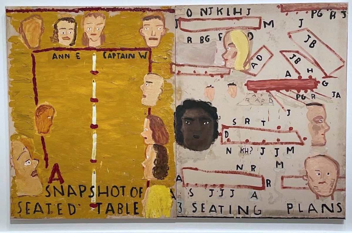
Rose Wylie: 3 Seating Plans and Seated Table, 2025 – Oil on canvas, 182 x 290 cm, photograph Paul Carey-Kent, courtesy the artist and David Zwirner
PCK: Let’s start with a recent work. ‘3 Seating Plans and Seated Table’ is unusual in being directly about the art world, about who sat where at dinners you attended?
RW: Well, yes, the subject isn’t often done. It wasn’t intended to be a seating plan, but I keep a diary and often draw a rectangle and put dots around it with people’s initials. Six months later, I’d forgotten about that particular function and I thought ‘why have I drawn a Viking boat, with all the little lines coming off it like oars?’ And sails? It was quite a theatrical dinner, and there were candles up the middle of the table, and sloping ceilings. Then I liked the initials: I often show three little lines to indicate grass, to give an overall energy, so here I painted the black initials all around instead– I wanted more, so in the end there were three dinners and three seating plans included. And then I put the black face in. That’s the waitress: she was quite spectacular, and because she was grumpy, she never smiled. I liked that. And once I put her in, I thought ‘I’ll put a few more faces in’. One is a ‘token blonde’ – you often have a blonde somewhere, so I stuck one in. Then there’s a token kind of banker or land owner or anyway, a sort of stereotypical figure of authority. Another looked like a Scottish chief to me. One of the heads looks like one of my children. So they weren’t necessarily people at the dinner; they were types I wanted to include, but the waitress is a real person.
So you ended up with lots of heads – fourteen, I think?
Yes, and heads are difficult things to paint, so I wondered, ‘Why am I doing a large painting with so many heads?’ They can look cutsie or ridiculous or slimy when you don’t mean them to. But I liked the contrast: one side of the painting is saturated with paint, thick with that yellow ochre that looks very nice when you look up at it, close, and from low down; the other side is more like a diagram, more linear and with less colour: different. My affectionate nickname for the painting was ‘Rothko and Rembrandt’, even though that isn’t the title – you have the Rothko saturated-colour and towards-the-Rembrandt amount of heads, The Night Watch.
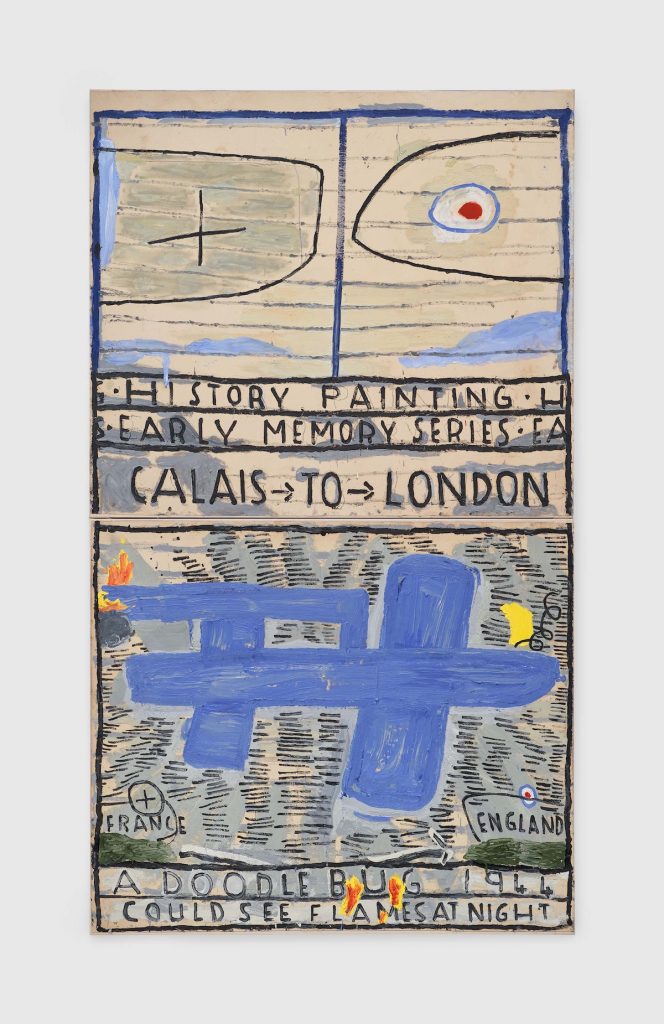
Rose Wylie, Wing Tips and Blue Doodlebug, 2022/2023, Oil on canvas, © Rose Wylie, Courtesy the artist and David Zwirner
‘Wing Tips and Blue Doodlebug’, like many of your paintings, includes a lot of text. What appeals to you about that?
Medieval manuscripts have text and images, as do newspapers and magazines; and at school, you needed to add notes to scientific-drawings; and maps to geography; and illustrations to written information in history. I always liked that, I like the contrast between image and text – and lettering can be used to unify a painting. Plus, it’s easier to do than faces! I enjoyed doing the flames and mixing them up with the text at the bottom, as if they are balancing each other. Another contrast is how the top is very linear and open, and the bottom is very filled in. I often like the halves of a two-canvas work to be different, but complementary. The division of the two images with a horizontal band of text seems an appropriate separation, somehow referencing know-your-own: useful wartime enemy-instruction booklets for children.
And it’s a ‘history painting’ from your childhood during the Blitz in Kent?
Yes, it may not be a history painting in the grand way of David, Ingres or Delacroix, but the Second World War is as good as any war, so why not. Sometimes people complain that I don’t show events accurately, but there’s no need for that – the point is to be accurate to the memory, and I always make that as near as possible. I like painting doodlebugs – they’re also easier than faces! And I’ve done lots. Did you notice they always point the same way? That’s because I always looked out of the same window as they came across the sky from France to London, so that’s part of the accuracy of memory.
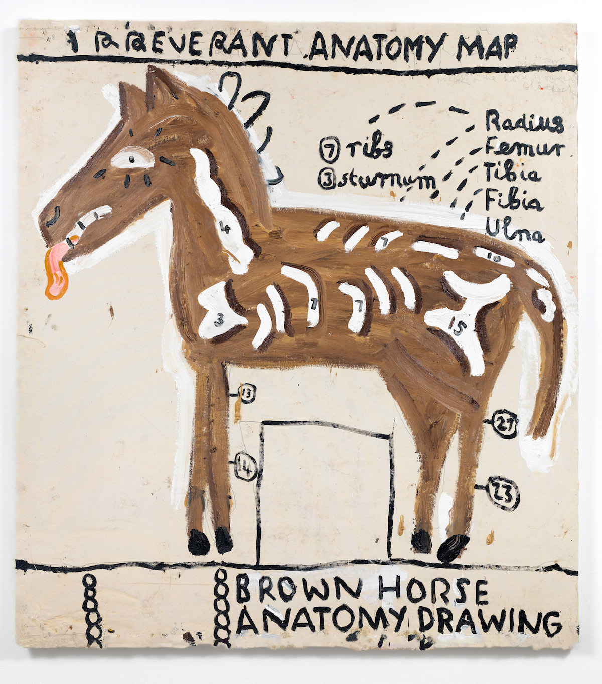
Rose Wylie, Irreverant Anatomy Drawing, 2017 – Oil on canvas, 182 × 165 cm, Courtesy Edwin Oostmeijer, © Rose Wylie. Courtesy the artist and David Zwirner
Tell me about the ‘Irreverent Anatomy Drawing’
You see that door at the bottom? A rectangle. In a way, we are looking at a house, like an Egyptian house painted by a Haji painter to commemorate a pilgrimage to Mecca: they would be hired to paint means of transport, planes, lions, or horses on the front of the house. So the horse becomes huge!
But that’s not the irreverence?
No, I’m ‘Irreverent about the bone structure and proportions we had to learn about at art school. I do like numbers, though, I put those on first but didn’t have room to write all the labels.
I see you spell it ‘irreverant’ – is that being irreverent about the spelling?
It’s not deliberate, no, I didn’t notice that! On big paintings with more than one canvas I’ll be working back from the middle, backwards, and that can lead to spelling mistakes, too. But I don’t mind, I want to get away from the idea that a computer is involved, that everything is checked and corrected by something else.
You make a lot of big paintings. How does that work?
I join canvases together so I can work big, but I also like the structure. I used to paint on the floor, but now I have them stapled on the wall together so I can paint as if they are one canvas, and then stretch them separately. I think of early Renaissance murals, and of paintings that go over niches, or follow the architecture in churches. I also like mosaics on the floor. Painting has had shabby treatment, being confined to the wall, and often small!
Rose Wylie: Bagdad Café (Film Notes), 2015 – Oil on canvas, 182 x 372 cm, Courtesy of British Council Collection, Photograph courtesy Jari Lager, Photo: Soon-Hak Kwon
You’ve also mentioned the scale of the cinema screen being relevant, given your love of film. Perhaps that leads us to ‘Bagdad Café (Film Notes)’ titled for the film directed by Percy Adlon in 1987, a comedy-drama set in a remote truck stop and motel in the Mojave Desert in California, inspired in turn by Carson McCullers’ novella ‘The Ballad of the Sad Café’, 1951. It focuses on two women who have recently separated from their husbands, and the blossoming friendship that ensues as they run the café together. How did that painting develop?
It actually started from my diary, with the picture of my slightly irregular teeth as I lick a spoon. I often use my diary – it has parallel lines and numbers, which I like, and gives me a chance to use my looping writing. The film is rather like The Tempest – the Prospero figure is Jasmin, the actor Marianne Sagerbrect, who is dumped at a café at the start of the film, chucked out of her husband’s car after fighting with him, with just a suitcase, and walks to the nearest habitation. I often note people’s physical shapes. And she’s rather square, a different shape from most film stars, but pretty, and I kept some of that look. But, in the painting, she has become Brenda, the other leading woman, C G Pounder, (mixing ‘shape’ and nationality). She wears a white frock with pleats, and a hat of convolvulus-leaf, (in the film, a brown hat with a feather) that leads to the pink trumpet flower – she has a son who played music on an old-fashioned gramophone. The drawing on the right is an objective one from my diary – it’s a flower that comes up every year, if you leave your lawn unmown for twelve years! It’s delicate yet strong. I pay homage to marginalised plants that aren’t given respect. If that convolvulus grew only abroad and big, it would be very expensive at the florist, but as they grow here, wild, people just walk over them on the ground, without noticing.
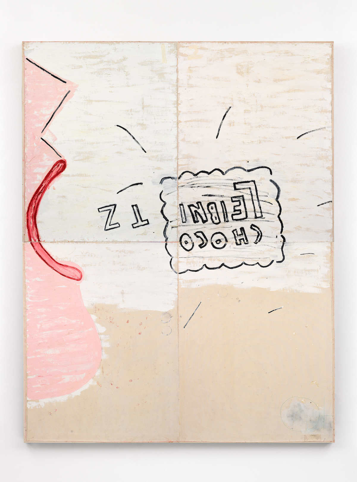
Rose Wylie: Photo: Soon-Hak Kwon and Choco Leibniz, 2006 – Oil on canvas, 366 × 285 cm, Tate: Lent from a private collection 2023 © Rose Wylie. Courtesy the artist and David Zwirner. Photo: Jack Hems
You often base paintings on your stream of daily drawings. The show includes both the drawing ‘Choco Leibnitz (self-portrait)’, 2006, and the far larger painting ‘Choco Leibnitz’, which followed. What were you aiming for by turning the drawing into the painting?
I didn’t think I’d previously made the most of the big format (with four 6 ft canvases), which you would, by showing something small across them …a detail of a face, instead of a whole figure which I’d painted earlier. So that’s what I did.
You’ve said you paint things because you want them. Are those your favourite biscuits?
Yes, I like them, but they have to be the dark ones. I wondered whether, from that angle, my teeth would show if my mouth was as open as possible to accommodate the biscuit– so I looked in the mirror, and I couldn’t see my teeth, so that’s actually what my mouth did look like.
Have you licked off the chocolate?
No, but it has lost its colour, yes. In the painting I needed decisions about how to emphasise my face. I put white round the chin, but not a line as on the nose, though that is a broken line, and so it echoes the flicks around the biscuit, which show it is travelling at speed towards the mouth. So there are conflicting registers of representation. I had to put all four canvases together on the floor to get the biscuit joining-up right.
I don’t think there’s a ‘T’ in ‘Leibniz’
Ah, no, more of the spontaneous feeling!
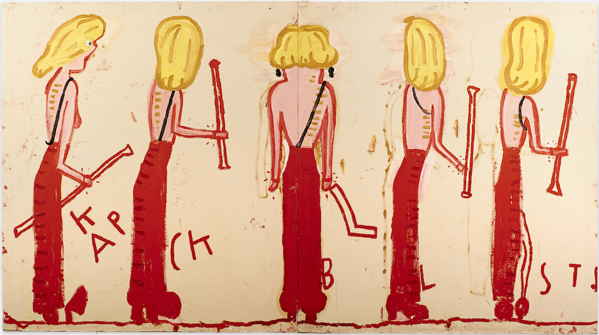
Rose Wylie: NK (Syracuse Line-up), 2014 – Oil on canvas, 185 × 333 cm, Courtesy private collection, CHOI&CHOI Gallery and JARILAGER Gallery, Photograph courtesy Jari Lager. Photo: Soon-Hak Kwon, © Rose Wylie
‘NK (Syracuse line-up)’ brings together three of your interests: modern celebrity culture, fashion, and the ancient world?
I’m a fan of Nicole Kidman, and I saw her on the red carpet and thought at first she wasn’t wearing a top, just a gathered skirt, and then I saw the black strap. But I couldn’t remember exactly how it went – I kept trying, and the middle one is right, but I kept them all to show my thoughts. She has the piled-up hair, and bling earrings, and a lovely pink skirt. Very glamorous. Most women wouldn’t wear that skirt as ‘gathers’ make your hips look big, but she is very tall and slender, so never mind. I thought she looked like a child, so I put her in big shoes, as if she was wearing her mother’s shoes the way girls do.
Where does Syracuse, the Sicilian rival to Athens two millennia ago, come in?
That refers to a marvellous, ancient double-banked frieze of women playing instruments, pipes of some sort. So that’s what she’s holding. Things have been mixed together, as in Bagdad Café, but not so much. I did several paintings of Kidman, and I actually prefer ‘Black Strap (Eyelashes)’ – but people do like the line-up!
So you’ve changed quite a lot?
Yes, it relates to her, but sideways. The inventions emphasise things, I don’t see them as distortions. The key is the picture as end in itself, not in servitude of representation, but hoping for transformation.
Walking around the show, it’s very colourful, but not every colour. Lots of what I might call ‘Rose Pink’, lots of blues that don’t contain green, greens towards yellow, but orange and purple are rare?
That’s true – I don’t like the look of them. The early Renaissance is a great learning area for colour, and you don’t see them there either.
What are people surprised to learn about you?
They think I should be 26, just by looking at the paintings. Or they think I’m a student. But I don’t care: age gives me more experience, so it’s a good combination – seeming young when you’ve got all the knowledge of an older person.
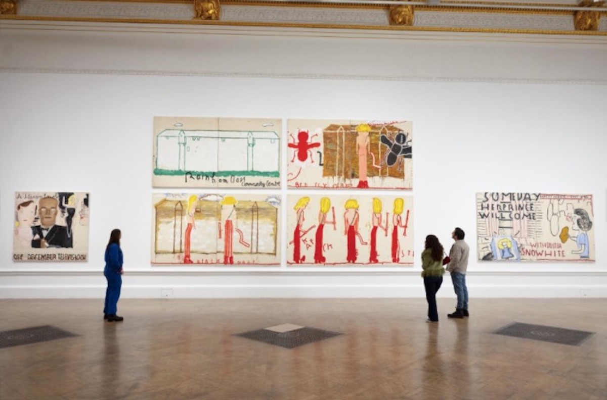
Installation view, Photo © Royal Academy of Arts. London / David Parry. © Rose Wylie
Top Photo: Rose Wylie, (Detail) No.19, Autre magazine, Sittingbourne, 2024 – © Juergen Teller, All Rights Reserved, Courtesy the artist and David Zwirner
‘Rose Wylie: The Picture Comes First’ runs at the Royal Academy of Arts, London to 19 April, 2026.