

Barbara Hepworth’s move to Cornwall with her family in 1939 transformed her practice and her use of colour.
Five days before the Second World War started, Barbara Hepworth, her ten-year-old son Paul Skeaping, her second husband Ben Nicholson, their triplets Simon, Rachel and Sarah Hepworth-Nicholson, and the cook, piled into their car in Hampstead and left for St Ives, Cornwall. The artist brought remarkably little else, ‘I did the maquette for the first sculpture with colour, and when I took the children to Cornwall… I took the maquette with me, also my hammer and a minimum of stone carving tools.’ Four years passed before Hepworth would carve it into a larger wooden version, Sculpture with Colour (Oval Form) Pale Blue and Red (1943), but during this coastal time – balancing her practice with motherhood – she would consolidate every aspect of her work.
She set up her studio in Trewyn Studio, St Ives. The clarity of Cornish light, the windswept landscape, crystalline sea, and the constantly changing sky on a distant horizon were reflected in the rhythms of her family life. In subsequent years, Hepworth began to see sculpture as something relational: ‘the main sources of my inspiration are the human figure and the landscape; also the one in relation to the other.’ Central to her vision of interconnectedness was colour; through watery blues, sunlit yellows and fine red string, she developed a visual language that signalled Cornwall’s salt-drenched coastlines, nature’s generative potential and the intimate bonds of maternity. Though materials were scarce in wartime Britain, she experimented with coloured sculptures in plaster, then wood and stone. At night, when her children (triplets!!!) were asleep, she made fine pencil drawings, highlighting forms with painted colours. Referring to these works as sculptures’ in disguise’, more than notes, they allowed her to explore and develop her ideas and play with colour.
Barbara Hepworth, Curved Stone With Yellow, 1946
Lauded for her purity of form, direct carving and ‘truth to materials’, this chromatic aspect of her practice has been largely overlooked. It is the focus of The Joseph Hage Aaronson & Bremen Exhibition: Hepworth in Colour at the Courtauld in London, curated by Dr Alexandra Gerstein and Dr Stephen Feeke. The first exhibition devoted to Barbara Hepworth’s economic but purposeful use of colour, it unites 18 sculptures and 26 drawings and paintings across two rooms. ‘Hepworth used painted colour in harmony with sculptural form rather than for decorative effect,’ explains Feeke in the introduction. ‘Carefully applied to inner surfaces and often accentuated by strings of a different hue, her poetic colour invited the viewer to contemplate the interior volumes of her pierced and hollowed sculptures.’
Why Hepworth’s essential relationship with colour has been occluded until now might have something to do with the black-and-white studio photographs art historians have used as source material, suggests Feeke. It might also be because colours are fugitive – especially blue – and part of the research carried out by Gerstein seeks to identify what pigments the artists used and if/how colours might be restored. What this show makes manifestly clear is that colour, found in lucent, singular hues inside her work, was central to the artist’s understanding of form. The key to this show lies in the title’s preposition ‘in’ colour. Hepworth did not add colour ‘on’ but found it within the materials she carved, or embedded tones that transformed cavities into infinite sky pools, or sun catchers.
Hepworth’s interest in the potential of colour to create spatial and optical effects dates to the mid-1930s, when she and her future husband, Ben Nicholson, fraternised with the European avant-garde and artists like Naum Gabo and Antoine Pevsner. A trip to Piet Mondrian’s studio in Paris exposed her to the architectural principle of ‘constructivist colour’; the isolated hues in his grid-like paintings were used to provoke specific reactions in the viewer. Blue recedes calmly into the shadows, red rushes forwards with a vital passion. Before her move to Cornwall, most of Hepworth’s sculptures were carved in wood or stone; forms enhanced by the natural grain or tones. The move to Cornwall allowed Hepworth the chance to experiment with new ideas. She began piercing holes through her forms and painting interior cavities with bright, contrasting colours (blues, reds, yellows). Her sculptures were not a representation of something, but dynamic forms that changed as you moved around them (like the land with the seasons), with light and tone bouncing and reverberating. In A Pictorial Autobiography (1970), Hepworth described this as “penetrating the landscape”, and the painted interiors made the void feel alive and connected to what was all around.
Barbara Hepworth, Oval Form 1956, oil and pencil on board
At the heart of this show is Sculpture with Colour (Oval Form) Pale Blue and Red,1943, (see lead photo), widely regarded as an important turning point in her development as an abstract sculptor. The sculpture emerged after she finally gained access to wood for carving. An oval form pierced by an opening, unusually, she painted the exterior a smooth ‘milk white’; its interior is a soft duck egg blue and taut red strings traverse the void. Walking around the sculpture, the strings appear to converge into a distant point then radiate outward, creating an unusual sense of shifting space. It is worth noting that this sculpture became the subject of a major campaign in 2024–25 to prevent it from leaving the UK after being sold to an overseas buyer. Following a temporary export bar and a successful £3.8 million fundraising effort, it was acquired for the national collection.
While not as immediately iconic as the works we find in room two, Tides II (1946), Pelagos (1946), and Wave (1943-44), this sculpture represents in her trajectory, her thinking about colour and form. Everything that would preoccupy Hepworth for the rest of her career is already present in this work: ‘The closed form,’ she writes, ‘such as the oval, sphere or pierced form, is in its own way a translation of what one feels about the human being in the landscape.’ Red tensioned strings stretched inside the ovoid became a recurring feature in later sculptures, while the pale blue that fills its cavity creates an illusion of infinite space, evoking both the oceanic horizons of Cornwall and the boundless expanse of the sky. Like a futuristic seed pod, one cannot help but wonder whether the delivery of three babies, when she was expecting only one, must have turned her world and sense of perception inside out.
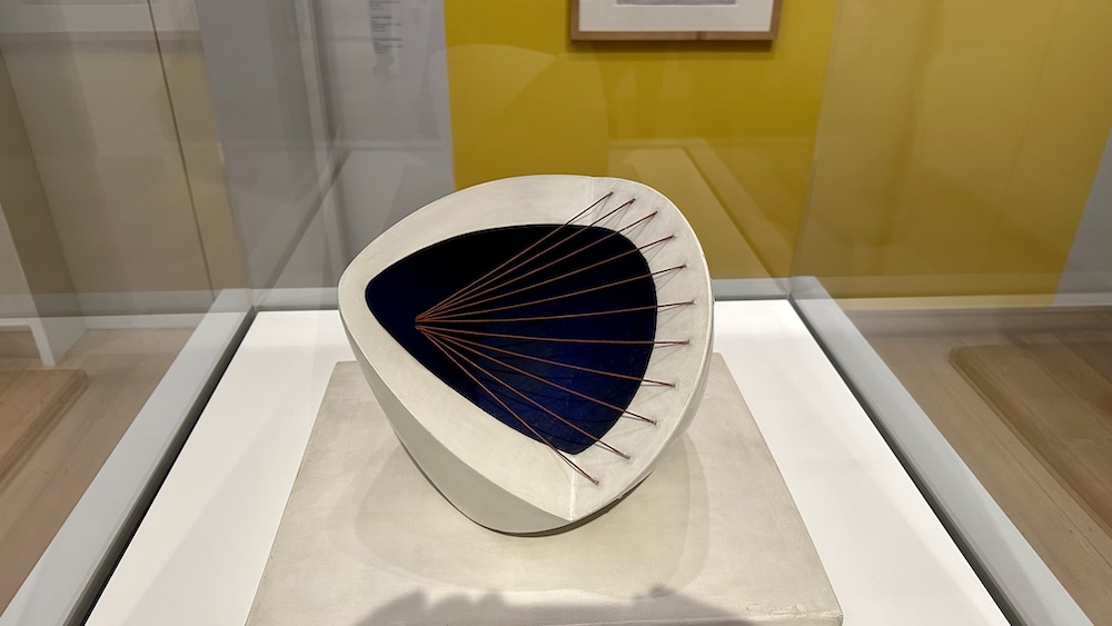
Barbara Hepworth, Sculpture with Colour (Deep Blue and Red) 1940
Of all the colours, it seems blue was her favourite; not a deep blue, but a gentle sky blue composed of white cloud shot with a little cobalt. “The colour in the concavities plunged me into the depth of water, caves, or shadows deeper than the carved concavities themselves.” Hepworth used this colour to create space within her work and expand the possibilities of form. Looking into or through her sculptures, blue anchors her forms to the coastal environment, whilst also creating a spiritual dimension in the work, one that suggests being part of something greater and unknowable.
Cornwall altered Hepworth’s perception of light and of form. Before Hepworth and Henry Moore, sculptors generally treated the interior of a sculpture as hidden. To Hepworth, a sculpture was not a solid object but a relationship between mass and space. “I, the sculptor, am the landscape. I am the form, and I am the hollow, the thrust and the contour.” We see this expressed in the vertical work Sculpture with Colour (Eos), 1946, a bright blue oval at its centre like an eye. In making the void part of the work, she reveals space not as absence but as a positive element.
Her use of yellow suggests a more embodied relationship between time and space. Working outdoors in the garden at Trewyn Studio as the spring sun warmed the earth, and flowers bloomed, her awareness of how colour could embody sensation intensified. In works such as Curved Stone with Yellow (1946), we find the yolk colour as a concentrated source of warmth and energy within the sculptural form. It evokes a cast of sunlight, but also something bodily and organic, the egg-like interiority of living forms. This nourishing colour activates our taste buds, whilst the surrounding milky whiteness suggests a benevolent protection. A form that lightly suggests yin and yang, representing dualism and dynamic balance in ancient Chinese philosophy, it echoes another work in the show, Tides II (1946), in plain wood, painted white and blue; yet our experience of the two is completely different. Hepworth was fastidious about colours, understanding that their visual impact relied on their remaining pristine. In Gertstein’s essay, Hepworth’s Colours (Deep Blue to Queer Green), we find detailed maintenance and restoration instructions. ‘With coloured sculptures, the thing is to see that it is handled with clean hands… Should yellow become damaged, ask a reputable artist to repaint with pure cadmium pale. On no account must paint slip over the edge of the hollow, as it can never be got off.”
Thinking about the chaos of four children running underfoot, her focus and clarity of vision seem even more extraordinary. Reflecting on the birth of her triplets in 1934, she later wrote that ‘the tenderness of a child’s body, the contour of movement, gave me a new perception of form.’ Raising four children while maintaining a sculptural practice sharpened her awareness of care, interdependence and connection. Whilst she had help, ultimately everything fell on her shoulders. In this context, the red strings that appeared in her work can be read as visualisations of invisible bonds. Their umbilical colour evokes blood, life and the heartstrings. Connecting from the edges of form, while spanning empty space, one cannot help but think that she is trying to capture, or contain something, whilst simultaneously creating support.
These delicate structures appear both architectural and organic, beautifully fragile like a spider’s web. Tensioned lines that became one of the defining features of her work, Hepworth described strings as a means of expression, the tension between herself and the landscape: the pull of the sea, push of the wind, and slant of the rock. Equally, they carry powerful associations with matters of the heart and human relationships. Wonderfully, pure colours hold all these possibilities and invite the viewer to complete the picture with their own.
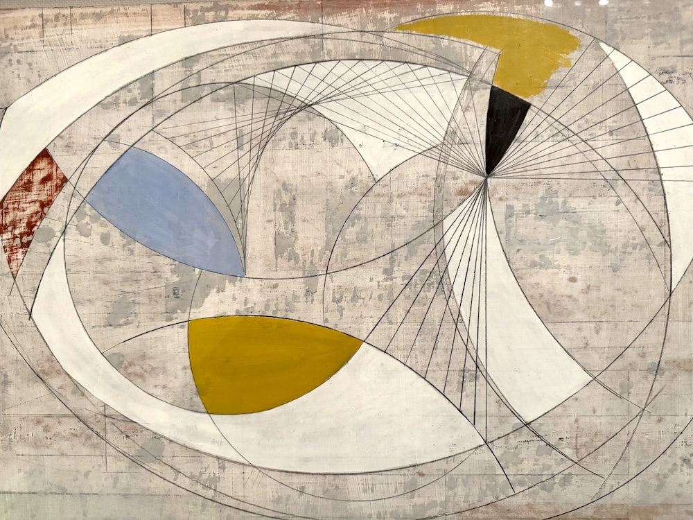
This delicate suggestiveness extends to her many drawings, in fine graphite and floating planes of colour. In Oval Form, (1956), Counterpoise, (1946), or Spiral with Red, (1949), the joy and freedom Hepworth found in colour is manifest. Repeatedly deconstructing and reconfiguring ovals and circles into fantastical new compositions, there is always colour placed at the point of balance.
What makes this Courtauld exhibition so compelling is how we see many themes converge through colour, and yet it is not prescriptive. As with her apertures, things are left to our imagination: in blues we see ocean or sky, but also her search for integration of form with the landscape; sunlit yellows, like repined husks, carry the vibrant yoke of life, and feelings of nourishment; and red articulates the emotional and physical bonds that connect one life to another, mother to child. Her love for a ‘queer green’ – a pigment synthesised from copper, phthalocyanine green (PG7) known as ‘Monastral’ – could represent ‘caves pierced by the sea’ or the unfurling buds in spring.
“The incoming and receding tides made strange and wonderful calligraphy on the pale granite sand, which sparkled with felspar and mica. The rich mineral deposits of Cornwall were apparent on the very surface of things… geology and prehistory.”
Hepworth explored the relationships that mattered most to her in the balance of form, space and tone. As Hepworth later reflected, “All my sculpture comes out of landscape, the human figure and my experience.” In colour, she found a way to make visible what lay at the heart of her sculpture: artists do not stand apart from the world but exist in a complex, often unknowable network of relationships that forge character and impact their practice. One just has to keep an open mind, let the light in, and the colours will speak for themselves.
The Joseph Hage Aaronson & Bremen Exhibition, Hepworth in Colour, The Courtauld Gallery, 12 Jun – 6 Sep 2026
Visit Here